

Hero components fill the entire width of the window and contain a large image (Hero Image) at the top of your page that "help set the tone for the content of your site", according to the US Web Design System.
Hero components optionally may contain the page title or headline, a small amount of text in an overlay, and a single link or a button in an overlay.
The NSF Hero component is designed for high visual impact and is popular for landing pages. Because the high visual impact would be diminished through overuse, the hero component is limited to one per page and isn't available for all page types.
Hero image best practices
The Hero component takes some practice to use well, but results can be rewarding with careful image selection.
In general, a good hero image:
- Functions more as wallpaper than a detail image. The Hero sets mood and tone and is not intended for accurate infographics, charts, maps, diagrams, group photo, portraits, or any other visual content where detail is important.
- Has no text. Text in an image, except for pure decoration, creates accessibility issues. The large Hero component will pixellate, crop, and/or obscure the text. Use the Hero component's Headline Text to create an accessible text layer on top of your image.
- Is high resolution, such that the main visual content will not pixellate at larger sizes.
- Does not need an NSF logo. The logo is prominent in other parts of the page.
Hero image specs & responsiveness
A Hero image is principally a wide format, so wide aspect ratio is better. Aim for at least 1.7 times wider than the height (expressed as 1.7:1).
|
Field |
Width |
Height |
Aspect ratio |
Notes |
|
Hero, aka Full-Width Image |
1920px |
1080px |
16:9, also measured as 1.78:1 |
This is the preferred full size of a Hero image; it displays at high quality on large monitors. |
| Hero, aka Full-Width Image | 1366px | 768px | 16:9, also measured as 1.78:1 | This size works well also but will be less detailed than 1920px. Note the aspect ratio is the same as 1920px X 1080px. |
| Top image on News item or Blog post. | 1200px | 468px | 2.56:1 | Images at the top of News items and Blog posts are significantly different than Hero images in size and features (no text overlay). Unlike Hero images, these images do not crop at different sizes. |
Pro tip: the 1366px size is very useful when you have a larger image that you want to change the location of a focal point. By making a larger image smaller you can crop out extraneous visual elements and to bring attention to particular visual elements that remain.
Images in the Hero component change greatly at different window sizes
One of the more noticeable effects of the Hero component is that images adjust in several ways to fit different size displays. You can see this in action by opening a page with a Hero component and adjusting the window size.
This can make Hero images somewhat difficult to use - it can even crop out or obscure important visual content.
Above in this page, we reviewed what makes a good Hero image. If you've made it this far, you probably want to see what happens to an image at different sizes.
Hero image example at 1920px width, a common desktop window size
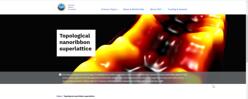
In the large example, the window is 1920px wide, a common desktop window size. The superlattice image is ideally placed, with the focal point slightly right-aligned to avoid being obscured by the white text box, which is slightly left-aligned.
Hero image example at 456px, a common mobile window size
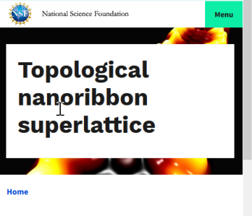
In the smaller example, the same hero image is shown at a common mobile window size. There is certainly less detail than in the larger desktop example, but the bright colors and the lattice pattern are still visible.
Although both examples use the "Text in white box" style. at this size the text box obscures much of the image. The example also uses long words in the headline, which make the text box larger. The other style, "Text over image" may be less obstructive, as may using shorter words in the headline, if that is an option.
Responsive Design causes the Hero images to resize (and all text and images, too)
Responsive refers to responding on-the-fly to make adjustments to fit the user's device.
Responsive Design applies to many aspects of a web page, such as images, text, buttons, and menus. Most are not noticeable as much as the Hero component.
For example a change in text size happens more quickly because the rendering speed of text is much faster than images.
US Web Design System requires Responsive Design
NSF.gov, is based on the US Web Design System, which currently requires Responsive Design.
Hero image do's and dont's

Do: Select a relevant image that conveys a consistent meaning, even when cropped
You've selected a great looking image relevant to your page content. The Hero component will crop your image unpredictably at different sizes. Consider whether your image has consistent meaning when parts of the image are cropped out, and the center of the image is zoomed in or zoomed out.
If you have any concern your image will lose meaning if the whole image is not displayed, consider using a different image component that will display the whole image.
Pro tip: NSF’s Virtual Backgrounds provide excellent examples of stunning science images that work well as widescreen backgrounds.
Credit: National Science Foundation screen capture, adapted from Center for Astrophysics | Harvard & Smithsonian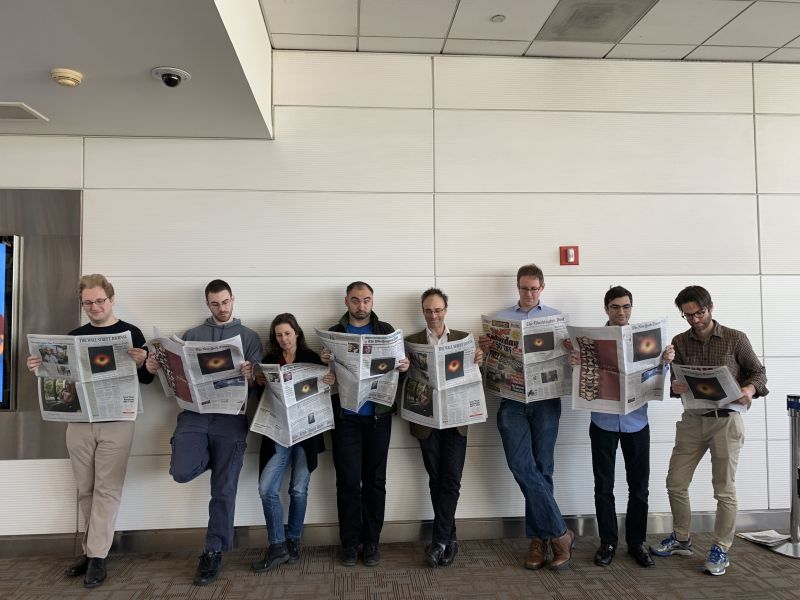
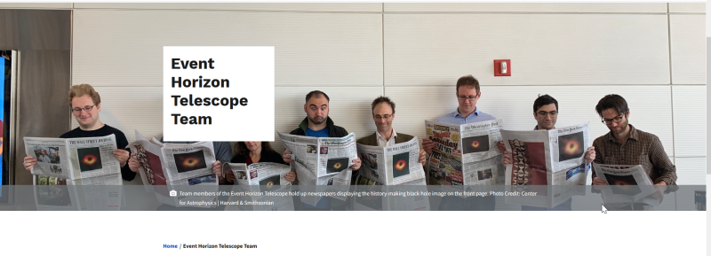
Don’t: Use images in a Hero that contain an important detail in the context of your web content
If there is an element in your image that visually communicates an important detail in the context of your content, it's best not to risk the cropping and overlays that occur with the Hero component. The same image will almost certainly look great in a standard image component, and your audience will be able to view all of the image as intended.
The first example above obscures peoples' faces in the group photo when displayed at 1920px width, a common desktop window size. At other sizes (not shown), people can get cropped out of the photo or appear headless. All these issues can be avoided by using a standard image component.
The second example shows the same image in a standard Image component. This technique removes the Headline that obscures faces and allows the full image to display at different sizes - without cropping. Other benefits of the standard image are simplicity, ease of use, multiple layouts available, and it's available on more types of pages.
Pro tip: NSF’s Science Matters has many examples of compelling visual communications in different shapes and sizes, and does not use the Hero component.
The hero image is the largest image found on your page and creates a strong impression on site visitors. Images that are too small or do not follow the above sizing recommendations may display illegibly.
Focal points in an image usually contain the most important visual content. A left-aligned focal point will be overlaid by a Headline or Page Title. A focal point more than 1/4 left or right-aligned will be cropped at different screen sizes.
Pro tip: Adjust images to be uploaded as Hero images with a focal point in the center, or less than 1/4 right-aligned.
Hero image FAQ's
In the NSF CMS, hero images crop and resize when displayed on different sized screens. This cropping is especially hard to control, and it looks very different at different screen sizes.
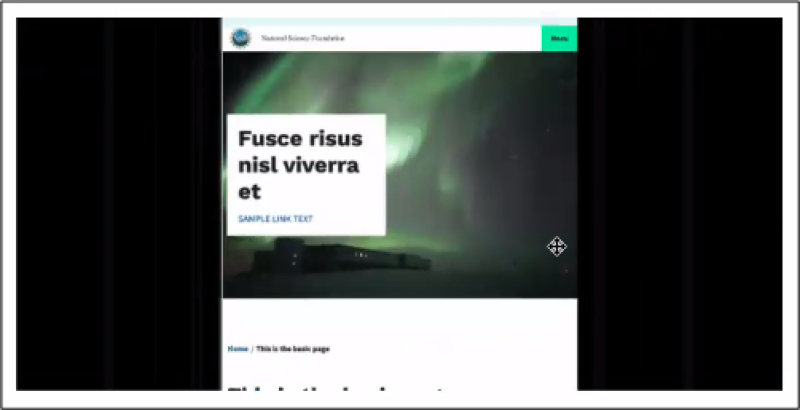
In the image below, the building appears at small window sizes, but disappears at larger sizes. Often the decision to use an image in a Hero component will be an editorial decision based on what is the important content. If the building is not highly relevant to your content, this image works well as a Hero.
Headline Text or Page Title is encouraged for Hero components. The Hero is an eye catching region at the top of the page, and it is a great place to put large text that describes the page. Keep in mind the headline or title will display on top of your image, potentially obscuring parts of the image below.
As with cropping of images, consider whether important details are lost. If you determine important details are not lost, go for a Hero!
In summary: The cropping of the hero image and the priority given to a headline and associated text create important considerations for choosing an image for a hero feature. Depending on the specific visual elements in your image, consider carefully whether the meaning of the image changes if a certain visual element is cropped or obscured.
To use a hero image effectively without losing important visual content, consider the following special criteria (in addition to the considerations for images above).